I’m trying to think of a way to organize my thoughts about La Sagrada Família (1882-present). My thoughts about Casa Batlló and Casa Mila center on color and surface, and form; so I think I’ll just carry that along. But honestly, there is a level of sensory overload with Sagrada that defies immediate analysis. But this at least allows me to edit the slide show into a single post that doesn’t swamp the internet.
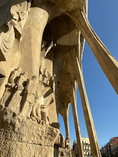
Yesterday we tried to capture the Passion (west-facing) façade, today, we enter through the Nativity (east-facing) façade. Like our previous experience in Siena, we found the “plain” façade first, so the “fancy” façade is a big step up in terms of sheer quantity of stuff. It’s the birth of Christ, and everything is coming to life. There are three kings, lots of animals, bugs, plants – all heralded by musicians with the trumpets raised. It is this façade and the first four towers, that Gaudí actually finished in his lifetime.
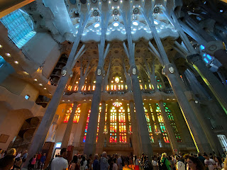
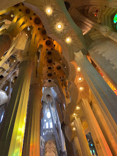
But the interior is where the architecture comes to life; it feels alive. We enter with the afternoon sun pouring through the Passion side (the “hot” side”), and the aisles are awash in red, yellow, and orange that splash across from the stained-glass to the columns on the Nativity side (the “cool” side).
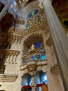
Unlike at Batlló, the colors are not applied to the surface; the various types of stone used in the columns and the wood are all allowed to be themselves. In fact, aside from some bold typography there is not much in the way of sculpture on the interior of the building itself. But it is the light from outside that is painting the walls and forms here.
And unlike at Mila, the forms themselves do not stay unadorned. The forms change with the light as the sun passes over the church from east to west. The light is also layered from high to low, like Mila’s light wells, with the clear clerestory glass allowing the canopy to pull in the clean light high above. Meanwhile the partial hyperboloid structures over the aisle function to keep the deepest hues down low, with the diffuse light bouncing, and the stained-glass murals reflecting off the floor.
In the museum we read how this is all as intended, as designed – Gaudí pushed the forms and building technology in order to create a space filled with discrete, changing light, employing an ingenious kind of practical geometry. I’ll admit I always though of Gaudí as an architect who was more about his faith and passion – an "artiste". But he was a true engineer and problem solver of the highest order, and he pushed the builders and engineers of Sagrada to be the same. Just looking at the way the color is stratified, and precisely controlled, within this complex and layered space, I am in awe.
We leave the temple through the Passion portico, depicting the last days of Christ, in blocky, allegorical forms. The excellent audio guide suggest we find a golden Christ sitting in heaven, on a little bridge between the two pairs of towers facing west.
It’s some of the best architecture I have ever seen.


No comments:
Post a Comment