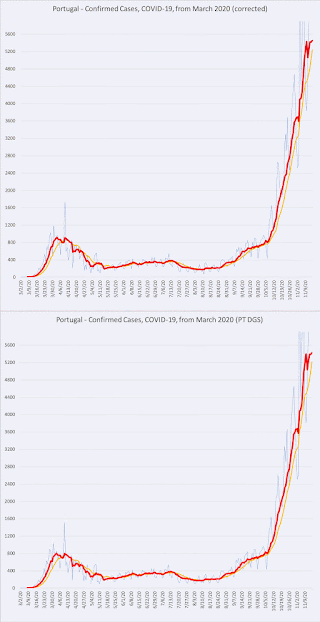
corrected graphs, COVID-19 case totals in Georgia (left) and Portugal (right)
I've been diligently entering data from Worldometers' COVID-19 database into my own graphs. Over the last few days things have gotten wonky with the data. Actually, I should explain that that the data from Georgia's DPH web site has always been a little wonky – the DPH would often increment the running total for cases, and also provide a different number of 'new daily cases' than mathematics would allow.
The cases reported today may not equal the difference in total cases between yesterday and today because previously reported cases may be removed as duplicate reports are corrected or may be reclassified as additional information is collected during case investigation.
For quite a while, Worldometer's data values tracked with the DPH's data, but a week or two ago there was some kind of correction. I assume that Worldometer applied corrected values for the 'confirmed cases' (Georgia's 'official' case number), by adding the 'antigen positive' cases to the running total – all the way back to March 12th, when the variance was just one. I'm not sure I've seen any other data source distiguish the 'antigen positive' cases without including them to their running total.
At first, the discrepancy was not too troubling, the graphs were vey similar. But recently, the two datasets grew very far apart, and I felt I had to update my own dataset. For example, for November 16th, Worldometer has a running total for cases of 426,236, versus the Georgia DPH total of 387,930, and death totals are 8,967 vs 8,471 (seven-day averages are 2,700.4 versus 1,964.1).
I've made the animated GIFs above to illustrate the change in the Georgia data (on the left). The light blue is the 'new daily cases' value, the red is the seven-day average, the yellow is the fourteen-day average. Note that the graphs are very similar, but that the 'corrected' graph is just slightly 'taller'. But for the more recent values, the trend lines show a much steeper rise, which is why I felt it was necessary to make the update. This also means I can continue to use the same data source (Worldometer) for the two locations.
Then, yesterday, Portugal also reported a running total that was much higher than 'new daily cases' number would mathematically allow. Evidently, there was some kind of "a change in the data analysis system". This required small adjustments all the way back to March 6th. In this case the two graphs are nearly identical except for a very slight vertical shift, especially pronounced during the early weeks – adjustments were spread over the entire time line, so the GIF (on the right) animation is hardly noticeable. Portugal's 'autumn spike' seems to have reached it's zenith (I truly hope), and I've adjusted the Y-axis accordingly in all the graphs.


No comments:
Post a Comment